Indonesia’s National Batik Day: Rational Application of BaZi Wu Xing Colors in Cultural Design, Seen Through Batik
Every October 2nd is Indonesia’s National Batik Day (Hari Batik Nasional). The intricate patterns and colors on batik cloth not only carry the archipelago’s cultural memory, but also resonate wonderfully with the ancient Eastern philosophy of **W
Opening Introduction
Every October 2nd is Indonesia’s National Batik Day (Hari Batik Nasional).
The intricate patterns and colors on batik cloth not only carry the archipelago’s cultural memory, but also resonate wonderfully with the ancient Eastern philosophy of Wu Xing colors.
Taking this holiday as a starting point, this article explores how BaZi’s five elements and five colors can be rationally applied in cultural design, unveiling the cosmic view and harmony rules behind batik colors, and letting traditional wisdom shine anew in modern creativity.
Basic Clarification: Wu Xing Colors Are Not Superstition
Common Misunderstandings and Correct Views
Many people equate BaZi five-element color matching with fortune-telling taboos, which is actually a narrow view of tradition.
Wu Xing five colors are the essence of ancient Chinese philosophy and aesthetics, first recorded in classics like the *Huangdi Neijing* and *Kao Gong Ji*. They represent a systematic color cognition based on the observation of nature, society, and the human body, not a mysterious force.
- Misunderstanding 1: Wu Xing color matching is only used in feng shui and destiny analysis, and has nothing to do with daily life.
- Misunderstanding 2: Colors must be strictly chosen according to one's personal BaZi favorable elements, otherwise misfortune will follow.
- Correct view: It is a color theory centered on natural rhythms and psychological perception, emphasizing harmony among colors, between colors and people, and between colors and the environment. It can guide design just like modern color theory.
- Clarification: Applying Wu Xing color matching in cultural design borrows its symbolic language and balance principles, not for predicting good or ill fortune. It belongs to rational aesthetic practice.
Core Points: Cultural Connections Between Wu Xing Color Matching and Batik
I. The Wu Xing Color Code: Traditional Aesthetics and Natural Philosophy
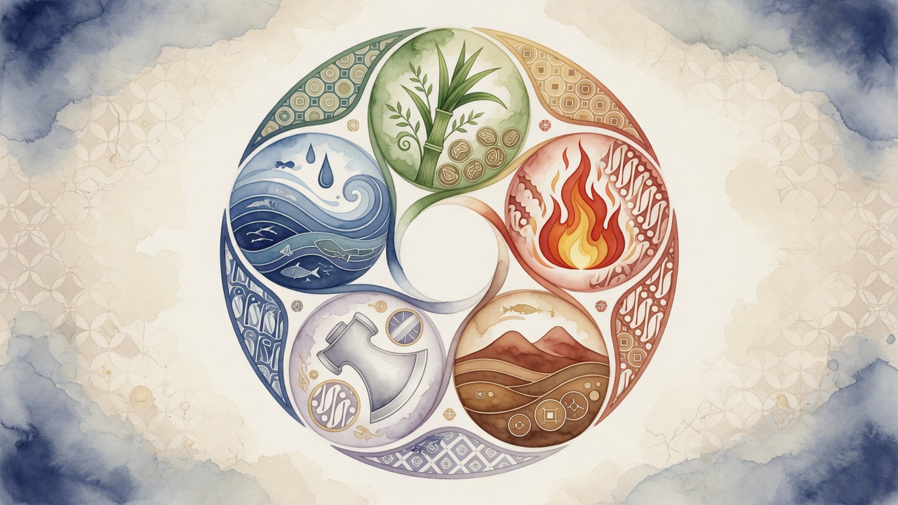
The five elements (Wood, Fire, Earth, Metal, Water) in BaZi each have their representative colors: Green/Blue, Red, Yellow, White, Black.
This classification stems from ancient people’s long-term observation of nature: green/blue of spring vegetation, red of summer scorching sun, yellow of the central plains’ earth, bright white of metallic luster, and mysterious black of deep pools.
The five elements are not isolated; they follow a cyclical cosmology of generating (Wood→Fire→Earth→Metal→Water→Wood) and controlling (Wood→Earth→Water→Fire→Metal→Wood) cycles, giving color combinations a dynamic vitality.
For example, Green (Wood) and Red (Fire) are in a generating relationship, and their combination can enhance warmth and vitality; White (Metal) and Green (Wood) are in a controlling relationship, and such a combination needs area adjustment or an intermediary color to buffer the sense of conflict.
Moreover, each color is associated with directions, seasons, and emotions: Green corresponds to the East, spring, and benevolence; Red to the South, summer, and propriety; Yellow to the Center, late summer, and trustworthiness; White to the West, autumn, and righteousness; Black to the North, winter, and wisdom.
Understanding this complete color symbol system gives you the key to open the door of Eastern design philosophy.
- Wood Green/Blue: Growth, expansion, symbolizes creativity; suitable for designs with education or health themes.
- Fire Red: Passion, celebration, strong visual impact; often used for festive items and brand vitality colors.
- Earth Yellow: Stability, inclusiveness, earthy tones bring a sense of security; a preferred choice for backgrounds and harmonizing colors.
- Metal White: Purity, decisiveness; often a main color in minimalist high-end designs, conveying technology and texture.
- Water Black: Depth, wisdom; creates solemn and focused atmospheres, but its area must be controlled to avoid oppression.
II. Batik Color Narrative: Wu Xing Mapping from Court to Market
Traditional Indonesian batik colors come from natural dyes: indigo produces a deep blue-black, soga (cudrania) yields warm brown, and the base fabric is off-white.
In Javanese court batik, blue symbolizes the sky, divinity, and the source of life; brown represents the earth, harvest, and motherhood; and white signifies purity and spirituality.
This “sky–earth–human” triadic structure resonates perfectly with Water (blue-black), Earth (yellow-brown), and Metal (white) in Wu Xing, forming a stable color ethic.
Later, influenced by Chinese, Indian, and Islamic cultures, batik from the north coast (Pasisir) boldly introduced bright colors like red, green, and yellow.
Red in bridal attire represents life force, consistent with the Fire symbol; green often evokes images of paradise, yet it also finds a harmonious basis in the generating relationship of Wood (green) and Fire (red).
A classic example is the Megamendung cloud pattern, where layered blue-and-white curves resemble the meeting of water and sky, a perfect interpretation of Wu Xing’s Water color.
The Kawung pattern, outlined in brown, white, and deep blue, forms intersecting circles that repeat symmetrically like the wheel of the universe, implicitly echoing the circular movement of Wu Xing generation.
- Wisdom of color limitation: Traditional batik used only three or four natural colors, yet created rich layers through dilution and overdying, akin to how Wu Xing uses five colors to give birth to countless hues.
- Wu Xing aesthetics in patterns: Many batik motifs are centrally symmetric and extend in four directions, just like the five elements circulating continuously in space.
- Cross-cultural color borrowing: From the 16th century, motifs like clouds, phoenixes, and red from China were absorbed into batik, forming a unique Fire-Earth palette in Peranakan style, still popular in festive attire today.
- Ritual colors as Wu Xing codes: In the ceremonies of the Yogyakarta Palace, different colored batik garments correspond to different ranks and hours, a concept that aligns with Wu Xing’s ceremonial color system.
III. Empowering Modern Design with Wu Xing Color Matching: Rational Application from Fabric to Screen
Contemporary designers do not need to rigidly adhere to BaZi favorable elements, but they can fully draw on the harmony and contrast principles of Wu Xing color matching to enhance the visual and psychological experience of their work.
When combining colors, give priority to the Wu Xing generating sequence: Wood generates Fire (Green→Red), Fire generates Earth (Red→Yellow), Earth generates Metal (Yellow→White), Metal generates Water (White→Black), Water generates Wood (Black→Green).
Colors connected in this order naturally possess a sense of flow and affinity, suitable for setting brand primary and secondary colors, spatial color transitions, and narrative lines in infographics.
If you wish to use a controlling combination, such as the strong contrast of Red (Fire) and White (Metal), you can reduce the area of one color, add neutral black or gray as a buffer, thus achieving a dramatic beauty where controlling contains generating.
In spatial design, different functional zones can borrow Wu Xing colors: a study can use Wood Green/Blue series to guide concentration; a dining area can be accented with Fire Red to enhance appetite and social atmosphere; bedrooms can predominantly use Earth Yellow tones for restful sleep.
In digital interfaces (UI/UX), when primary and secondary colors are selected according to Wu Xing generation, visual fatigue can be reduced; for example, a gradient button from dark green (Wood) to orange-red (Fire) is more comfortable than a random contrasting combination.
In cultural derivative development, Wu Xing five colors can be abstracted into geometric color blocks, combined with classic batik motifs, to create international gifts that retain Eastern philosophy while conforming to modern minimalism.
Some Indonesian designers have already tried to apply Wu Xing color matching to eco-batik series, blending indigo (Water), palm sugar brown (Earth), and chili red (Fire) with natural dyes, embodying sustainable and cross-cultural concepts.
- Building facades: If the color sequence of a large public building's exterior follows a Wood-Fire-Earth-Metal-Water gradient, it can create a soothing visual rhythm.
- Fashion collections: A season's theme color palette can be moderately adjusted according to the five-element nature of the season (e.g., Fire flourishing in summer), while keeping the brand's primary colors stable to create fashionable freshness.
- Graphic design: For posters or packaging, it is recommended to use a 7:3 ratio between primary and secondary colors based on the generating relationship, avoiding the chaotic feeling caused by equal proportions of controlling pairs.
Pitfall Avoidance Guide: Practical Precautions for Wu Xing Color Matching
Five Rules for Rational Application
- Avoid piling up all colors: You don’t need to cram Green, Red, Yellow, White, Black into one design. Usually two to three colors forming a dominant-subordinate relationship look more sophisticated.
- Respect local cultural taboos: Batik regions have specific color symbolisms; for example, in some areas black represents mourning. Research before designing, and do not simply overwrite with Wu Xing theory.
- Adjust lightness and saturation: Traditional Wu Xing colors are conceptual pure colors; in practical application, they need to be desaturated. For instance, use dark green instead of pure cyan, or cream instead of bright yellow, to integrate more easily into everyday settings.
- Control the proportion of controlling pairs: When pairing Red (Fire) with White (Metal), keep red below 30% or add dark gray as a separator; when pairing White (Metal) with Green (Wood), introduce warm yellow (Earth) as an intermediary to ease the conflict.
- Be mindful of color vision deficiencies: Wu Xing palettes often include red-green and yellow-white combinations. Never rely solely on color to convey key information; ensure accessibility by combining with textures, icons, or brightness differences.
- Test the effect of ambient light: The appearance of Wu Xing colors on textiles and prints varies greatly under different light sources. Indigo, in particular, tends to turn black; physical sampling is essential.
- Reject fatalistic packaging: In commercial narratives, emphasize Wu Xing color matching as Eastern aesthetic wisdom, and avoid using terms like “prosperity-boosting” or “auspicious colors” to maintain professionalism and rationality.
Summary and Recap
Indonesia’s National Batik Day celebrates not only the timelessness of textiles, but also reminds us that the ancient Wu Xing five colors are cultural genes that can be rationally activated.
By combining the principles of Wu Xing generation and control with the color practices of batik, designers can create works with both cultural depth and visual science.
Key conclusion: Wu Xing color matching is a systematic, derivable set of harmony rules, not mysticism. It is an Eastern design philosophy refined from nature observation.